Portal Page Example
One assembled screen showing how the Quick Actions and Teaser/Campaign reconstructions combine with other spark-ui components into a real portal page.
The Block Catalog lists ECP's built-in blocks one row at a time. Quick Actions and Teaser & Campaign reconstruct two of those rows in isolation. This page ties several reconstructions together into one screen, the way a real ECP portal page combines multiple blocks.
Like the other two pages, this is not ECP's actual page-composition output. It's a spark-ui reference reconstruction: a "My devices" home page assembled from PageHeader, List, the Quick Actions pattern, and the Campaign pattern, all from @epilot/spark-ui.
My devices
Quick actions
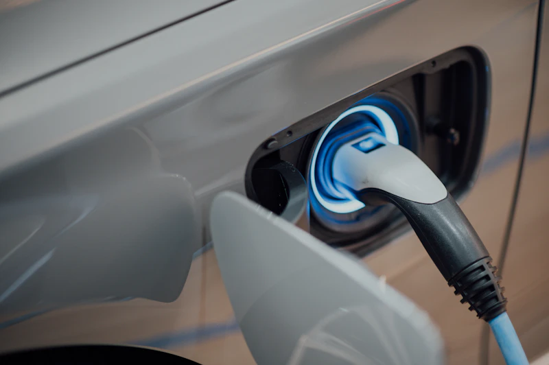
Install a wallbox before September and get free installation
Limited-time offer for existing solar customers.
The assembly
'use client'

import {
  ChevronRight,
  EvStation,
  HeatPump,
  Info,
  Payments,
  Settings,
  SolarPower,
  Speed,
  type SparkIcon,
} from '@epilot/spark-icons'
import { Button } from '@epilot/spark-ui/button'
import {
  Card,
  CardContent,
  CardDescription,
  CardTitle,
} from '@epilot/spark-ui/card'
import { Icon } from '@epilot/spark-ui/icon'
import {
  List,
  ListItem,
  ListItemContent,
  ListItemLeading,
  ListItemSubline,
  ListItemTitle,
  ListItemTrailing,
} from '@epilot/spark-ui/list'
import {
  PageHeader,
  PageHeaderActions,
  PageHeaderTitle,
} from '@epilot/spark-ui/page-header'
import { Thumbnail } from '@epilot/spark-ui/thumbnail'
import { SectionTitle } from '@epilot/spark-ui/typography'

const DEVICES: {
  icon: SparkIcon
  title: string
  status: string
}[] = [
  { icon: EvStation, title: 'Garage wallbox', status: 'Charging · 11 kW' },
  { icon: HeatPump, title: 'Heat pump', status: 'Running · 2.1 kW' },
  {
    icon: SolarPower,
    title: 'Solar inverter',
    status: 'Producing · 3.4 kW',
  },
]

const QUICK_ACTIONS: {
  icon: SparkIcon
  title: string
  subtitle: string
}[] = [
  {
    icon: Speed,
    title: 'Report a reading',
    subtitle: 'Submit your latest meter reading',
  },
  {
    icon: Payments,
    title: 'Download invoice',
    subtitle: 'Get your latest bill as a PDF',
  },
  {
    icon: Info,
    title: 'Contact support',
    subtitle: 'Chat with our team',
  },
]

function QuickActionTile({
  action,
}: {
  action: (typeof QUICK_ACTIONS)[number]
}) {
  const Glyph = action.icon
  return (
    <button
      className="flex w-full flex-col items-start gap-3 rounded-2xl bg-base-accent-soft px-4 py-3 text-left text-accent transition-opacity hover:opacity-90"
      type="button"
    >
      <Icon className="bg-base-accent-soft text-accent" variant="soft">
        <Glyph />
      </Icon>
      <div className="min-w-0 flex-1">
        <div className="text-base font-medium">{action.title}</div>
        <div className="text-sm opacity-70">{action.subtitle}</div>
      </div>
    </button>
  )
}

export function MyDevicesPage() {
  return (
    <div className="flex flex-col gap-6">
      <PageHeader>
        <PageHeaderTitle>My devices</PageHeaderTitle>
        <PageHeaderActions>
          <Button
            aria-label="Settings"
            color="neutral"
            size="icon-small"
            styleVariant="ghost"
          >
            <Settings />
          </Button>
        </PageHeaderActions>
      </PageHeader>

      <div className="flex flex-col gap-3">
        <SectionTitle>Your devices</SectionTitle>
        <List variant="surface">
          {DEVICES.map((device) => {
            const Glyph = device.icon
            return (
              <ListItem key={device.title} render={<a href="#" />}>
                <ListItemLeading>
                  <Icon>
                    <Glyph />
                  </Icon>
                </ListItemLeading>
                <ListItemContent>
                  <ListItemTitle>{device.title}</ListItemTitle>
                  <ListItemSubline>{device.status}</ListItemSubline>
                </ListItemContent>
                <ListItemTrailing>
                  <ChevronRight />
                </ListItemTrailing>
              </ListItem>
            )
          })}
        </List>
      </div>

      <div className="flex flex-col gap-3">
        <SectionTitle>Quick actions</SectionTitle>
        <div className="grid grid-cols-1 gap-3 sm:grid-cols-3">
          {QUICK_ACTIONS.map((action) => (
            <QuickActionTile action={action} key={action.title} />
          ))}
        </div>
      </div>

      <Card
        className="flex-col items-stretch gap-4 sm:flex-row sm:items-center"
        color="accent"
        variant="surface"
      >
        <div className="w-full shrink-0 sm:w-48">
          <Thumbnail
            alt="Close-up of an EV charging cable plugged into a car"
            radius="lg"
            ratio="4:3"
            src="/wallbox-offer.jpg"
          >
            <EvStation />
          </Thumbnail>
        </div>
        <CardContent className="flex flex-1 flex-col items-start gap-2">
          <CardTitle className="text-lg">
            Install a wallbox before September and get free installation
          </CardTitle>
          <CardDescription>
            Limited-time offer for existing solar customers.
          </CardDescription>
          <Button className="mt-1">Claim the offer</Button>
        </CardContent>
      </Card>
    </div>
  )
}
The page is four sections stacked in a flex flex-col gap-6:
PageHeaderwith just a title and a settings action. A home page has nothing to go back to, soPageHeaderBackButtonis left out and the title takes the header's centered column on its own; see Page Header for the back button and other slots.- A device list, standing in for an Entity List block on a device schema.
List variant="surface"glues the rows into one bordered panel; each row is a link (render={<a href="#" />}) with a leadingIcon, a title and status line, and a trailing chevron. See List for the row API. - A Quick Actions grid, the same themed tile from Quick Actions: a flat
buttonwrapper carrying the block's Style and Color, with a pinned-softIconchip. Condensed to three items, fixed to Brand and Soft, with none of that page's controls, since this page is a fixed assembly, not a configurable preview. - A Campaign card, the same accent
Card+Thumbnail+Buttoncomposition from Teaser & Campaign, withcampaign's "Allow dismissal" setting off so the assembly stays static.
Nothing here is wallbox-specific: swap the schema, the icons, and the copy, and the same four-section shape carries a contract page, a billing page, or any other page that mixes an entity list with a couple of promotional or shortcut blocks.